Let’s turn your wanderlust into a digital masterpiece. By creating a stunning, mobile-friendly Wix travel blog, you can captivate audiences and inspire fellow travelers. In today’s digital age, where smartphones are our constant companions, a website that seamlessly adapts to smaller screens is crucial.
A well-designed mobile-friendly travel blog is more than just a digital brochure; it’s a gateway to extraordinary adventures, a source of inspiration for fellow travelers, and a platform to share your unique perspective on the world.
Whether you’re a seasoned globetrotter or a budding explorer, join us as we dive into the exciting world of Wix and unlock the secrets to crafting an online haven that will leave your readers yearning for their next adventure.
Choose a Mobile-Responsive Template
5
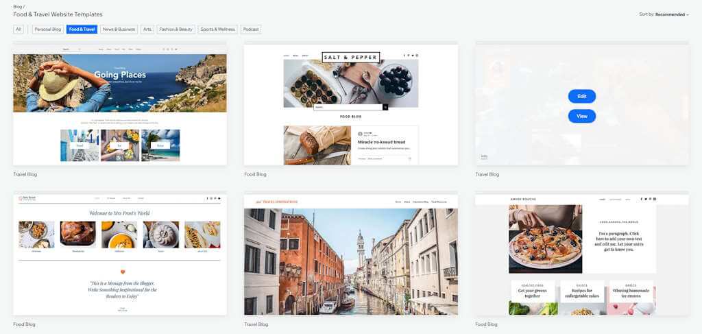
Wix offers a plethora of templates, many of which are designed to be mobile-friendly. To ensure an optimal user experience, look for templates with clean layouts, easy navigation, and large, clear images. Consider using a template specifically designed for blogs or travel blogs to streamline the design process and provide a professional look.
Visit:

Optimize Your Images
4
To ensure optimal performance on mobile devices, compress your images to reduce file size. This will significantly improve your website’s loading speed. Additionally, resize your images to fit the screen size of mobile devices to avoid unnecessary loading times and maintain a seamless user experience. Lastly, use descriptive file names for your images to enhance your website’s SEO and improve search engine visibility.
Visit:

Keep Your Content Concise and Easy to Read
3
To maintain reader engagement on mobile devices, use short paragraphs and bullet points to break up your text. Avoid using jargon and technical terms that may confuse or alienate your audience. Instead, write in a clear and concise style that is easy to understand.
Visit:

Make Your Website Easy to Navigate
2
A simple and intuitive navigation menu is crucial for a seamless user experience on mobile devices. Ensure your website is easy to navigate on a small screen by using clear and concise labels for your menu items. This will help visitors find the information they need quickly and efficiently.
Visit:

Test Your Website on Different Devices
1
Imagine your website as a globetrotting adventurer. It needs to look sharp and perform flawlessly, no matter where it lands – on a sleek smartphone or a trusty tablet.
To ensure your digital creation is ready for any adventure, give it a thorough test drive:
- Smartphone Safari: Does your website load as quickly as a cheetah chasing its prey? Are the images crisp and clear, or do they look pixelated? Can you easily navigate through your posts, or does it feel like you’re lost in a maze?
- Tablet Tango: How does your website look on a tablet? Is the layout balanced and visually appealing, or is it a chaotic mess? Can you effortlessly scroll through your content, or does it feel like you’re wading through quicksand?
Don’t forget to enlist the help of mobile-friendly testing tools. These digital detectives can uncover hidden issues, such as slow loading times or unresponsive elements, that could hinder your website’s journey to success.
Wix also has a mobile-friendly automation you can use. This may seem super simple (and sometimes it is!) but you should note that this automation may resize texts size and change your website layout when necessary to make each page mobile friendly. This should also be something to test before publishing your site!
Visit:

“Wix Editor helps us edit websites seamlessly to make them perform well on smartphones and tablets!”
WOW Travel
Creating Your Mobile-Friendly Wix Travel Blog: A Step-by-Step Guide
- Choose Your Perfect Template:
- Select a mobile-responsive template that’s visually appealing and easy to navigate.
- Look for templates designed specifically for blogs or travel blogs.
- Optimize Your Images:
- Compress images to reduce file size and improve loading speed.
- Resize images to fit mobile screens.
- Use descriptive file names to boost SEO.
- Write Mobile-Friendly Content:
- Keep paragraphs short and use bullet points.
- Avoid jargon and write in a clear, concise style.
- Prioritize Mobile Navigation:
- Use a simple, intuitive navigation menu.
- Ensure easy navigation on smaller screens.
- Use clear and concise labels for menu items.
- Test Across Devices:
- Test your website on various devices (smartphones, tablets).
- Use mobile-friendly testing tools to identify issues.
Tips for Creating Mobile-Friendly Wix Travel Blog
To ensure your Wix travel blog shines on mobile devices, consider these additional tips:
- A Speedy Host: Choose a hosting provider that’s as fast as a cheetah. A slow website will have your mobile visitors running for the hills.
- A Font Fit for a Phone: Select a font that’s easy on the eyes, even on the smallest screens.
- Big, Bold Buttons: Make sure your buttons are big enough to be tapped with ease, even by the clumsiest of thumbs.
- A Contact Form for the Mobile Age: Design a contact form that’s as simple to use as a walk in the park.
- Mobile Analytics Magic: Track your website’s performance on mobile devices with a user-friendly analytics tool.
By following these tips, you can create a mobile-friendly travel blog that will captivate your audience and leave them wanting more.
Are Wix websites mobile friendly?
Yes, Wix websites are designed to be mobile-friendly. Wix offers a range of features and tools that help you create websites that automatically adjust to different screen sizes, ensuring a seamless user experience on both desktop and mobile devices.
Can I edit a Wix website on mobile?
Yes, you can edit your Wix website on a mobile device. Wix offers a mobile editor that allows you to make basic edits, such as text editing (change the text content on your pages), image editing (replace or edit existing images), link editing (add, remove, or modify links), and layout adjustments (make minor adjustments to the layout of your mobile site).
However, for more complex edits, such as adding new sections, customizing the design, or working with advanced features, it’s recommended to use a desktop computer or laptop. The desktop editor provides a more comprehensive set of tools and a larger screen for precise editing.
Some images in this article are copyrighted by Wix.
